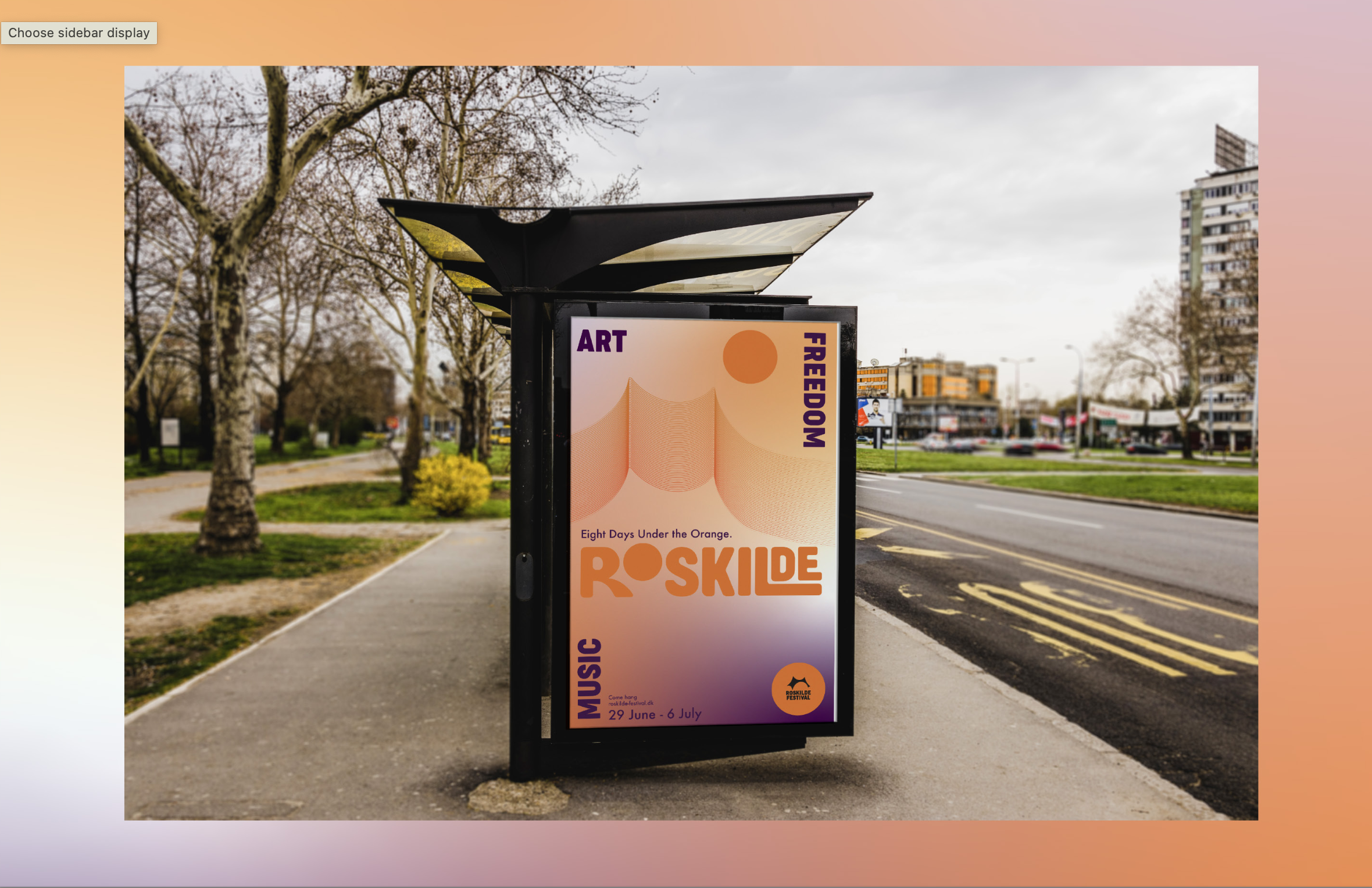
This Winter, I took a Design Studio course. I was nervous; I had never used Adobe InDesign before. I ended up falling in love with this program and spent hours in our computer lab at Allen Hall grappling with Adobe programs to get the look and feel of my campaign just right. My design concept blends the sunset colors of camping in a field at Roskilde with the concept of coming together to create community, which I represented through the use of circles. The Roskilde logo (the Orange Tent) is present throughout my campaign, as a part of the poster itself as well as within my typography. Look closely! For never having used InDesign before, I’m proud of this project for the grit I used to make it come together and produce something that looks professional. The work that follows is my final slideshow presentation for this project.

A summary of the key research that guided my design concept.

Word mapping to show how I got to my three key visual words.

My three key visual words. Journey: the journey of the Orange Stage from its origins on The Rolling Stones' European Tour to its final season at Roskilde, as well as the journey the festival's international clientele takes to get to the festival each year. Experiment: Roskilde is the largest festival of its kind, relying on volunteers and community to push the boundaries of social activism, art, and what it means to be a music festival. Community: Roskilde draws its visitors back year after year. People really care about this festival, and put in the work to make it happen.

My design concept combines the signature hue of the Orange Stage with the many definitions of the word "journey" that the festival celebrates.

A summary of the moodboards I created to inspire my work.

Some of the first iterations of my poster.

The second iterations of my poster as I learn how to use Adobe Illustrator and InDesign.

Adding color.

Mockup 1.

Mockup 2.

Mockup 3, Instagram Stories. I created these from scratch and did not use Smart Images.